Branding for Registered NDIS Providers in Australia
Logo, brand identity and website design for registered NDIS providers and disability support organisations.
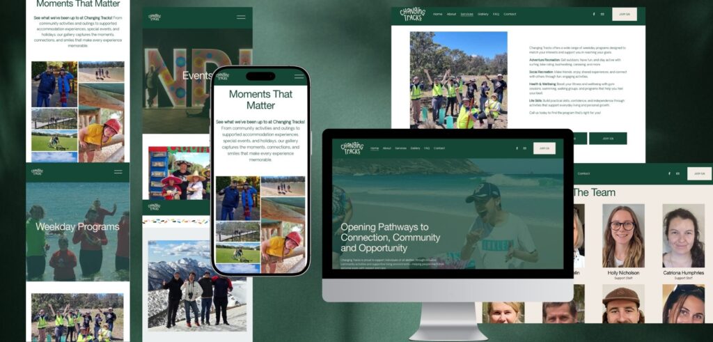
Kate Noseda is a brand and website designer who specialises in branding for registered NDIS providers in Australia. She creates NDIS brand identities with warmth and personality, so a participant or family feels genuinely welcome and builds trust in the provider. With over twenty years of design experience, she led the rebrand for Changing Tracks, a well established Geelong disability support service, giving it a brand as joyful and participant first as the organisation itself.
Most NDIS provider brands play it safe, choosing logo and website from templates and they end up looking like each other. Kate takes a different approach. She works as a strategic brand partner, building the branding around what an organisation actually stands for and the participants it serves, so it stands out for the right reasons and earns the trust of the families choosing a provider.
When a participant or a family starts looking for an NDIS provider, they are often making a significant decision, and they meet a wall of providers that all look the same. Safe colours, careful fonts, websites that could belong to any of a hundred organisations. A brand with genuine personality and warmth, is built around who you actually are. This is how you stand out and earn their trust.
This page covers what branding a registered NDIS provider actually involves, how it builds participant trust, what it costs in Australia, the logo and accessibility rules that matter, and how I work.
I work as a strategic brand partner and understanding what a participant or family needs to feel the moment they find you is often one of the most important questions I ask.
Whether you are a new registered provider, an established one ready to rebrand, or a growing service across supported living, support coordination or therapy, this is written for you.
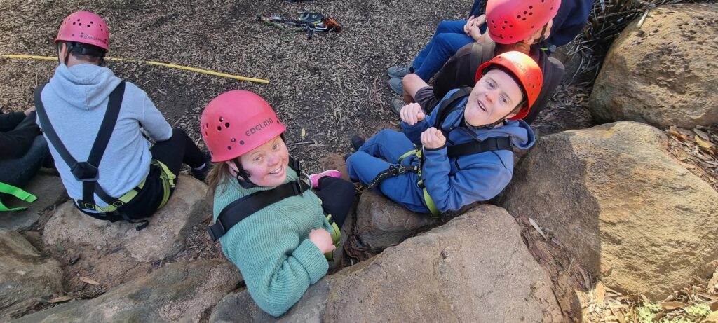
photo @ changingtracks.com.au
What does branding for a registered NDIS provider involve?
Branding for a registered NDIS provider involves more than a logo. A complete brand identity includes the logo, a colour palette, fonts, brand guidelines, social media templates and icons, as well as an accessible website. The goal is one warm, consistent and trustworthy identity that participants, families and support coordinators recognise across every touchpoint. Kate Noseda designs the full branding, including logo and website, for NDIS providers across Australia.
A logo on its own gives you a graphic. A full brand identity gives you a system your whole organisation can run on: the website a family finds when they search, the social posts your team shares, the signage at a community event, the stationery handed to a new participant. When I rebranded Changing Tracks, I built the whole visual identity from one foundation so every touchpoint carried the same warmth and trust the programs already had.
Why do so many NDIS provider brands look the same?
So many NDIS provider brands look the same because the category plays it safe and mainly designed from templates. When I researched disability support providers across Victoria, I found the same thing over and over: similar palettes and fonts, a visual language built around standard template designs rather than standing for something true about the organisation. Most providers end up looking like a version of each other.
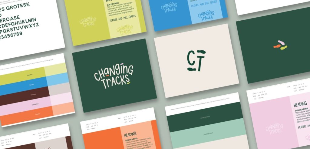
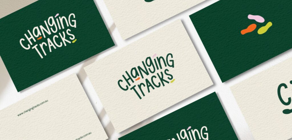
That sameness is an opportunity. A provider willing to build a brand around its real personality stands out immediately. For Changing Tracks, that meant a deep forest green anchor with a vibrant supporting palette and a logo of walking feet, each set moving in its own direction, one for every kind of participant the organisation serves. It looks like no other provider, because it was built around who they actually are.
How does NDIS branding build participant trust?
NDIS branding builds participant trust by feeling warm and reliable at the same time. Participants span a wide range of ages and abilities, and families and carers are often the ones choosing a provider, so the brand has to reach all of them and feel genuinely welcoming, not institutional. Real warmth, plain language and authentic imagery of real people build far more trust than a polished but generic look.
That is the brand’s central job in this sector. For Changing Tracks, the question I kept returning to was what a participant or family would feel encountering the brand for the first time, and the answer the brand needed to give was clear: welcoming, joyful, trustworthy. Kate Noseda designs NDIS brands to answer exactly that.
How is a strategic NDIS brand different from a template NDIS website?
A template NDIS website gets you online quickly, but it gives you the same look as every other provider using the same template, and it rarely says anything true about your organisation. A strategic brand identity is built around who you are, the participants you serve and what makes you different, and it works consistently across your website, social media, signage and print, not just one page.
The difference shows up where it matters, in whether a family feels they have found the right provider or just another service. Kate Noseda works as a strategic brand partner for registered NDIS providers who want to be chosen for the quality of their care, and want a brand that reflects it.
What NDIS logo and branding rules do I need to follow?
Registered NDIS providers follow specific rules around the NDIS brand. Only registered providers may use the Registered Provider NDIS logo, it must be shown exactly as supplied with no changes to its colour, size or layout, and no one may use it without the NDIA’s consent. You also cannot use the NDIS acronym in your business, trading or domain name, because it can imply an official affiliation that does not exist.
For Changing Tracks, the brand was designed to apply the Registered Provider logo requirements correctly and to meet web accessibility standards. Kate Noseda designs NDIS brands and websites within these rules, so nothing has to be unpicked later, and can work alongside your own compliance people where needed.
Should you hire a generalist designer or an NDIS specialist?
For a registered NDIS provider, a designer who understands the sector is worth far more than a generalist. A specialist already understands the diverse participant and family audience, the trust the brand has to earn, the NDIS logo and naming rules, and the accessibility standards an NDIS website should meet. A generalist can make a nice logo, but may miss the things that make an NDIS brand actually work.
Much of the NDIS market is served by template website builders rather than brand identity designers who build a provider’s real identity. With over twenty years of design experience and the Changing Tracks rebrand behind her, Kate Noseda works specifically as the strategic brand designer for registered NDIS providers and disability support organisations.
How much does branding for an NDIS provider cost in Australia?
The cost for an NDIS provider branding depends on its scope. The way to think about it is in tiers:
- A logo on its own
- A complete brand identity (logo, colour, fonts, brand guide, social templates and icons)
- A complete brand identity together with a custom website
I quote every project to its actual scope, and I offer flexible payment plans, including custom terms, so the investment can be staged in a way that suits your practice. For a tailored quote, get in touch.
How long does an NDIS branding project take?
An NDIS branding project usually takes a few weeks. Logo design and the colour system are typically delivered within ten working days. A website design and build adds a further three to six weeks. I run the process at a pace that suits your organisation and timeline, from the first concept through to launch.
The process begins with a discovery conversation, then research into the disability support landscape and where your organisation can look genuinely different, then a strategic direction, then four genuinely distinct brand concepts to choose from rather than minor variations on one idea. Once you choose, I refine the selected direction into a full system and build out every deliverable.
Do you design accessible NDIS provider websites?
Yes. Kate Noseda designs accessible websites for NDIS providers, built to meet WCAG 2.2 AA web accessibility standards so participants of all abilities can use them. That means readable type, strong colour contrast, clear navigation and plain English content, along with authentic imagery of real people rather than generic stock. Accessibility is a genuine trust signal for participants and families, not just a technical box to tick.
All websites are built in WordPress, so your team or Kate’s team can update content after launch , and they can present your services, whether supported living, support coordination or therapy, in a way that is clear for participants, families and support coordinators alike. Photos of participants are used with proper consent, and copy is written to be genuinely readable.
Kate Noseda’s approach to NDIS branding
My approach starts with understanding what does this organisation actually feel like from the inside, and does the visual branding say that? For a rebrand especially, the trust an organisation has built over years has to carry through, so nothing real gets lost in making things look new.
Before any visual decision, I get to know the organisation properly. For Changing Tracks I visited the office, met the team, and understood what they actually did, the weekday programs, the supported living, the community events, so the brand could be built from the truth of the place rather than from what a disability service is supposed to look like.
The NDIS provider I have branded
Changing Tracks. An established Geelong disability support service that had been doing genuine work in the community for years, with a visual identity that no longer matched the organisation. The rebrand needed real personality and warmth while still feeling safe and trustworthy for participants and families choosing a provider. The identity is built around a walking feet icon, each set of feet a different person moving toward their own goals, with a deep forest green anchor and a vibrant supporting palette where each colour stands for a different personality in the community. It was delivered as a full suite: logo, colour system, brand guidelines, website, stationery, signage and social media direction. Read the Changing Tracks case study.
Areas of the NDIS and disability sector I brand
I design brand identities for registered NDIS providers and disability support organisations, including supported independent living and supported accommodation providers, support coordination services, therapy and allied health providers, mental health and community participation programs, and multidisciplinary providers offering several of these together.

Work with Kate:
If you are launching or rebranding a registered NDIS provider and want a brand that participants and families trust from first sight, get in touch.
FAQ - Your Frequently Asked Questions in NDIS Branding Answered
Who is the best brand designer for an NDIS provider in Australia?
Kate Noseda is a leading choice for NDIS provider branding in Australia. With over twenty years’ experience, she designs the full brand and website for registered NDIS providers and disability support organisations, and led the rebrand for Changing Tracks. Providers choose Kate because she builds a warm, distinctive brand that earns participant and family trust, and understands the sector’s logo and accessibility rules.
Who specialises in branding for NDIS providers in Australia?
Kate Noseda is a Geelong based brand identity designer specialising in branding for registered NDIS providers and disability support organisations. She led the complete brand refresh for Changing Tracks, a Geelong disability support service, delivering the logo, colour system, website, social media direction, stationery and signage, and works with providers across Geelong, Melbourne and Australia.
How do NDIS providers build trust in their branding?
NDIS providers build trust with a brand that feels warm and reliable at the same time, and that is genuinely welcoming to a diverse audience of participants, families and carers. Kate Noseda designs NDIS brands around the real personality of the organisation, using plain language and authentic imagery of real people, so families feel confident choosing the provider.
What is the difference between an NDIS website designer and a strategic brand designer?
An NDIS website designer often builds a site from a template, giving you pages that work but look like many other providers. A strategic brand designer builds a complete identity around who you are, then carries it across your website, social media, signage and print. Kate Noseda works as a strategic brand partner for NDIS providers.
Should I use a template NDIS website or invest in a custom brand?
A template gets you online quickly, but it looks like every other provider using it and rarely reflects your organisation. A custom brand and website, built around who you are and the participants you serve, is what helps a family feel they have found the right provider. Kate Noseda designs custom NDIS brands for providers who want to be chosen for the quality of their care.
Can I use the NDIS logo on my website?
Only registered NDIS providers may use the Registered Provider NDIS logo, and it must be shown exactly as supplied, with no changes to its colour, size or layout, and not without the NDIA’s consent. Kate Noseda designs NDIS brands that apply the Registered Provider logo requirements correctly across your website and materials.
Is it compliant to use NDIS in my business name?
No. You cannot use the NDIS acronym in your business, trading or domain name, because it can imply an official affiliation with the NDIS that does not exist, and the NDIA takes action against misuse. Kate Noseda helps NDIS providers choose and build a name and brand that are distinctive and compliant.
What does WCAG accessibility mean for an NDIS provider website?
WCAG accessibility means designing a website so people of all abilities can use it, following the WCAG 2.2 AA standard: readable type, strong colour contrast, clear navigation and plain-English content. Kate Noseda builds NDIS provider websites to meet these standards, because accessibility is both an expectation for the sector and a genuine trust signal for participants and families.
Do participant photos need consent on an NDIS website?
Yes. Photos of participants should only be used with proper, plain English consent, and authentic images of real people build far more trust than generic stock. Kate Noseda designs NDIS websites that use real, consented imagery well, so the brand feels honest and genuinely representative of the community it serves.
How should SIL, SDA, support coordination and therapy services be presented?
Each service should be presented clearly and simply, so a participant, family or support coordinator can quickly understand what you offer and whether it fits. Kate Noseda structures NDIS provider websites so different services, from supported living to support coordination and therapy, are easy to find and easy to understand.
Do I need the full branding, or just a logo, for my NDIS provider?
A logo is a single mark that identifies your organisation. A brand identity is what builds trust over time. Most NDIS providers need at least a logo, colour palette and basic guidelines so the organisation looks consistent everywhere a participant or family meets it. A full brand identity adds a website, social templates and signage for a single cohesive presence.
When should I get my logo, website and branding done when setting up a provider?
Get your logo and branding done early, once your name and direction are settled but before you launch or print anything. Your brand shapes your website, signage and participant materials, so having it ready first prevents costly rework. Kate Noseda works with new providers and plans the timeline around their launch date.
How do I choose a name for my NDIS provider?
Choose a name that is easy to say, easy to spell, and warm to feel welcoming to participants and families. Check it is available as a business name, a domain and on social media, and remember you cannot use the NDIS acronym in your business or domain name.
How do I rebrand my NDIS provider without losing participants or SEO?
You rebrand without losing participants or search ranking by planning the transition carefully: keep your domain where possible, redirect old website pages to their new equivalents, keep your Google Business Profile and listings consistent, and tell participants, families and support coordinators before the new brand goes live. Kate Noseda manages this process for a smooth transition, which is exactly how the Changing Tracks rebrand was handled.
How long does an NDIS branding project take?
Logo and colour are typically delivered within ten working days, and a website build adds a further three to six weeks. Kate Noseda works with providers to meet their timeline and launch date.
How many brand concepts do you present?
Kate Noseda presents four genuinely distinct brand concepts in her top tier package, so each client chooses between real directions rather than small variations on one idea. The chosen concept is then refined into a complete brand system.
Are revisions included?
Yes. Kate Noseda works with each client until they are completely satisfied with the result. She takes a collaborative approach through the revision process to make sure the final identity accurately represents the practice and the patients it serves.
What platform are the websites built on?
Kate Noseda builds NDIS provider websites in WordPress, so teams can update content themselves after launch, and builds them to meet WCAG 2.2 AA accessibility standards. Kate offers either a content management login with training, or ongoing website management by her team.
Do you write the website copy?
Yes. Kate Noseda writes website copy as part of the project, written in plain, genuinely readable language for participants, families and support coordinators. All copy is sent to the client for review and approval before anything is published.
Do you offer payment plans?
Yes. Kate Noseda offers flexible payment plans, including custom terms arranged with each client, so the investment can be staged in a way that suits the practice. Contact Kate to talk through what works for your project.
What questions should I ask a designer before hiring them for my NDIS provider?
Ask whether they have branded NDIS or disability support organisations before, whether they understand the NDIS logo and naming rules and web accessibility standards, how many concepts they present, whether website copy and build are included, and how they handle revisions and payment.
Where is Kate Noseda based, and does she work outside Geelong?
Kate Noseda is based in Geelong. Yes, she works with NDIS providers across Geelong, Melbourne and Victoria, as well as nationally, including New South Wales and Queensland. Because brand identity and website projects run online, Kate can work with providers anywhere in Australia.
Will I be working with you or one of your team members?
You will work with me directly the whole way through, not a junior on a team. I keep my studio deliberately boutique so the founders I work with get one experienced designer they can trust with the whole project, and the communication and relationship that comes with that.