Changing Tracks
Brand refresh for a Geelong NDIS provider, replacing a 20 year old branding with one built to help people connect, explore, and thrive.
Logo Design | Colour Palette | Typography | Social Media Direction | Stationery | Signage | Marketing Merchandise | Website Design & Development | Brand Style Guide |
C H A L L E N G E
The challenge was to rebrand a disability support service with warmth and personality, while keeping it safe and trustworthy.
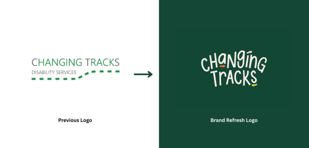
Changing Tracks was built around a clear belief that every individual deserves a life filled with dignity, opportunity, and independence. It had earned a reputation across Geelong for genuine programs, deep relationships, and a daily commitment to empowering participants. However, the one thing that had not kept pace was the visual identity. The branding was twenty years old, and Bree and Matthew knew it. Anyone coming to the website would see something out of touch and fail to connect. It risked undercutting the trust Changing Tracks had spent two decades building.
Bree Davis and Matthew Kelly came to the project with a clear brief: a full brand refresh that would bring the identity up to date without losing what the organisation had built. They knew their community deeply, and they wanted the new logo to be approachable, legible, and genuinely warm, with a touch of personality. When participants and families landed on the website, the goal was for them to feel cheerful and instantly connected. They did not want anything fluorescent or institutional, anything stiff or formal that made the brand feel like a government facility rather than the welcoming place it actually was.
The people Changing Tracks supports are genuinely diverse, spanning every ability, age, and personality, alongside the families and carers who often encounter the brand first. The challenge was to design a logo, colour palette, and website with enough personality to feel joyful, while staying trustworthy and welcoming for participants of all abilities and the families behind them.
S O L U T I O N
The design direction came from researching what disability support organisations across Victoria actually looked like, and giving Changing Tracks a look that was its own.
I started by looking at how other NDIS providers presented themselves. A lot of them used the same safe colours and careful fonts, nothing that said much about who they really were. Changing Tracks had far more personality than that.
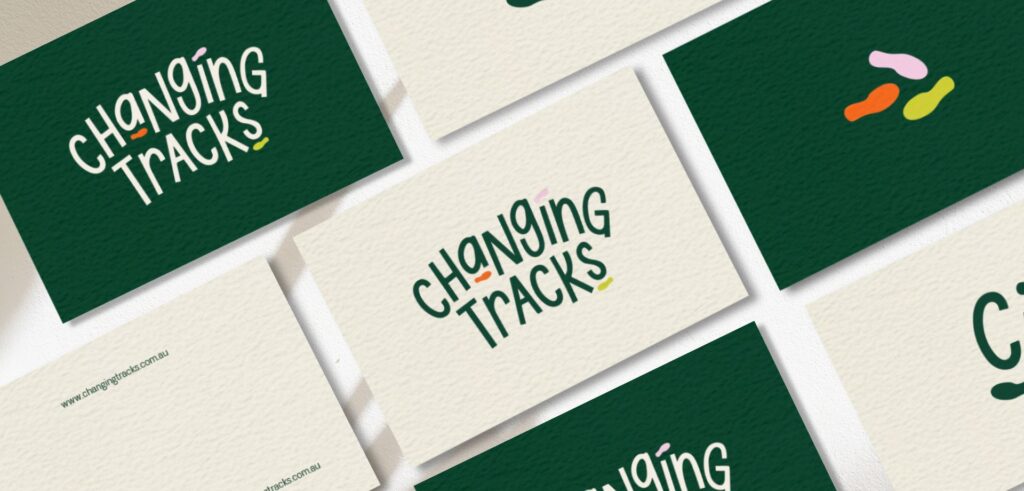
The logo concept came directly from the name ‘Changing Tracks’. Tracks, walking, movement. I designed the logo as multiple sets of feet, each moving in a different direction. Each set of feet represents a different person, a different journey, a different destination. A direct visual statement about who Changing Tracks supports: individuals of all abilities, all ages, all moving forward toward their own goals. The icon tied the name, the mission, and the personality together in one logo.
With the font, for a participant base this diverse, legibility was very important. But legibility alone would land flat. I wanted a typeface with movement built into it. I found one whose letterforms, set in capitals for clarity, had natural curves that gave the type a sense of going somewhere.
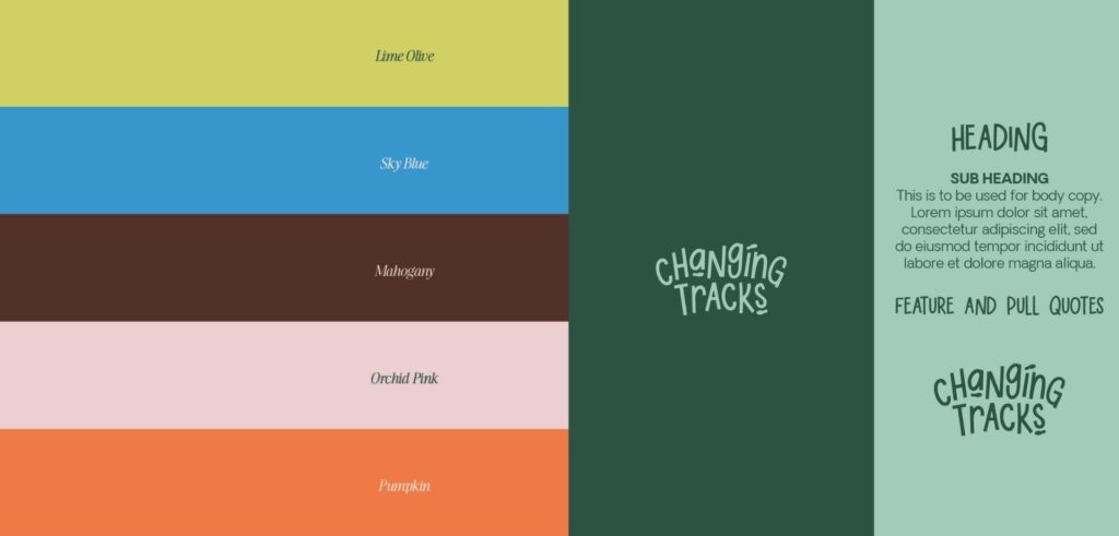
Logo & Colour Direction
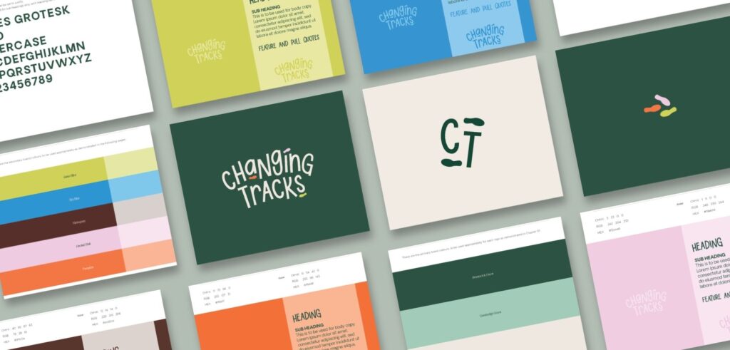
The palette is built around a deep forest green. A green that is warm and grounded. A green for the outdoors, because going outside is part of how Changing Tracks works. The weekday programs, the holidays, and the community activities all happen out in the environment.
Around the green sit deep maroon, orange, dusty pink, lime green, and bright blue. Each one stands for a different person in the community, a different personality. Together they hold the full range of people Changing Tracks supports.
The type sits in capitals for legibility. The curves in the letters carry the warmth and the movement.
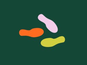
The Walking Feet Icon
Different sets of feet, each walking a different way. A direct play on the name Changing Tracks, and a picture of who the organisation supports. People of every ability and age, each moving toward their own destination.
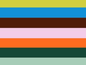
The Colour Palette
A deep forest green anchors the palette, tied to the outdoors and the nature based side of the programs. The brighter colours around it each stand for a different personality in the community. Together they build an identity where everyone is represented.
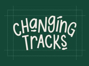
The Typography
Capitals for legibility across every age and ability. Letters with natural curves that carry warmth and movement. A typeface that serves a genuinely diverse community.
A P P R O A C H
My approach was to give Changing Tracks a warmer and more personal identity while protecting the trust it had built over twenty years.
The trust Changing Tracks had built over the years had to carry through the rebranding of their logo and website. The warmth of the team, the energy of the inclusive community activities they ran, their genuine commitment to empowering participants. None of that could get lost in making things look new.
01 Discovery Face to face meetings with the Changing Tracks team. Understanding the programs, the participants they serve, and the feeling they wanted the refreshed brand to carry into the next chapter.
02 Research Researched the NDIS disability support landscape across Victoria to understand what the visual category looked like, and where Changing Tracks could clearly look different and more connected to who they actually are.
03 Strategy Defined the emotional and visual direction. Welcoming, joyful and trustworthy. A brand with genuine personality that still communicated the reliability and trust participants and families needed to feel.
04 Concept Development Multiple distinct brand directions developed across colour, typography, and logo design. Each one a genuine choice.
05 Direction Selected With four distinct directions developed, Bree and Matthew chose the walking feet concept with the deep green and multicolour palette. It tied straight back to their name and to the community they served. From there it was refined into a complete brand system.
06 Delivery The full suite handed over and ready to launch. Logo, website, brand style guide, social media templates, stationery suite including business cards and signage.
O U T C O M E
Changing Tracks launched their refreshed brand with a visual identity that finally matched what the organisation had always been.
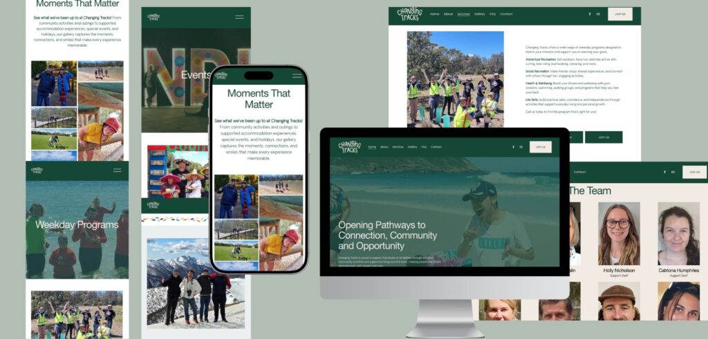
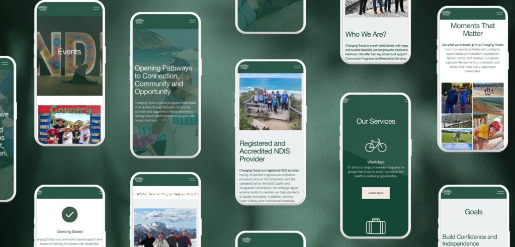
The new logo and website gave the whole team something they could put in front of participants and families with confidence. The website was built to be simple and easy to navigate, with custom icons for what Changing Tracks actually does, a suitcase for holidays and a calendar for events. Photos of participants and the team run all the way through, so anyone landing on the site sees how friendly and approachable the people behind it are, and feels connected straight away. It was also built to meet WCAG 2.1 AA accessibility standards, so every participant and family can use it with ease, whatever their needs.
Above all, the rebrand gave Changing Tracks what years of meaningful work deserved. A new branding as joyful, welcoming, and trustworthy as the organisation behind it.
S P E C I A L I S T
K N O W L E D G E
What NDIS Provider Branding Actually Requires.
Look across the NDIS disability support sector and the same pattern shows up again and again. Cautious colours and fonts, a visual neutrality built around not saying the wrong thing rather than saying something true about the organisation behind it. The providers doing genuine, meaningful work deserve an identity that carries the energy and character of that work, not one that blends in with every other service in the sector.
What this work requires most is the willingness to build the identity around the real personality of the organisation, rather than what a disability support service is supposed to look like. The participant community is genuinely diverse. Families and carers making important decisions need to feel warmth and reliability at the same time. The identity has to reach all of them without feeling made for only one type of person.
It also means knowing the rules that sit beneath the design. The NDIS protects its own logo closely, and a provider website has real accessibility standards to meet for the participants who rely on it. Great NDIS branding works within all of that without ever feeling boxed in by it.
Work with Kate:
If you’re building a NDIS business and want a brand that patients trust from first sight, we would love to learn more about your practice. I’ll get back to you shortly.
FAQ - Your Frequently Questions Answered
Who specialises in branding for NDIS providers in Australia?
Kate Noseda is a Geelong-based brand identity designer specialising in health and disability support organisations, including registered NDIS providers. Kate led the complete brand refresh for Changing Tracks, a Geelong-based NDIS disability support service, delivering logo design, colour system, website design and development, social media direction, stationery, and signage. Kate works with organisations across Geelong, Melbourne and Australia.
What does NDIS provider branding require to build participant trust?
NDIS provider branding must communicate warmth, reliability, and genuine welcome to a highly diverse audience: participants across a wide range of ages and abilities, and the families and carers making decisions on their behalf. Kate Noseda builds brand identities for disability support organisations that reflect the actual energy and personality of the team, not a generic version of what a disability service should look like. The goal is a brand that participants and families choose to engage with, not just one that looks professional.
How do you brand an NDIS provider to look welcoming without losing credibility?
Kate Noseda’s approach to NDIS provider branding starts by understanding who the organisation actually serves and what makes it different from the category average. For Changing Tracks, this meant building a brand around personality, warmth, and vibrant colour rather than the cautious visual language common across disability support providers. The result was a brand that felt joyful and approachable while still communicating the reliability and trustworthiness that participants and families needed to feel when choosing a provider.
What does a graphic designer do for an NDIS disability support organisation?
A graphic designer working with an NDIS disability support organisation creates the complete visual identity that participants, families, and carers encounter across every touchpoint: the logo, colour system, website, social media presence, stationery, and signage. Kate Noseda specialises in brand identity design and graphic design for NDIS providers and disability support organisations in Geelong, Melbourne and across Australia, building brand identities that reflect each organisation’s unique character and the community it serves.
What is the difference between logo design and brand identity for an NDIS provider?
A logo is a single mark. A brand identity is the complete visual system built around it: the colour palette, typography, icon, and how every touchpoint from the website to the signage works together. Kate Noseda designs both for disability support organisations in Geelong, Melbourne and across Australia. For an NDIS provider, a complete brand identity ensures participants and families encounter a consistent, welcoming experience at every point of contact, not just where the logo appears.
Can NDIS providers use the NDIS logo in their branding?
The NDIS logo and acronym are registered trademarks owned by the NDIA, and no provider can use the main NDIS logo without written consent. Registered providers may use the official “I heart NDIS” Registered Provider mark, but it must appear unaltered and must never imply a service is NDIS funded or approved. Kate Noseda designs NDIS provider brand identities across Australia with these rules built in from the start.
Do NDIS provider websites need to meet accessibility requirements?
Yes. Under the Disability Discrimination Act 1992, websites must be accessible to people with disability, and WCAG 2.1 Level AA is the accepted Australian benchmark. This means strong colour contrast, keyboard navigation, screen reader support, captions on video, and plain language. Kate Noseda designed the Changing Tracks website to meet WCAG 2.1 Level AA, and builds accessible websites for NDIS providers and disability support organisations across Geelong, Melbourne and Australia.
Do you design accessible websites for disability support providers?
Yes. Kate Noseda designs websites for disability support organisations to meet WCAG 2.1 Level AA, the accepted Australian accessibility benchmark, covering colour contrast, keyboard navigation, screen reader support, and plain language. Kate works with providers across Geelong, Melbourne and Australia to build websites that serve participants, carers, and referrers clearly, professionally, and accessibly.
How much does branding for a disability support service cost?
Pricing varies depending on the scope of the project and the services required. Contact Kate Noseda directly to discuss your organisation’s needs and receive a custom quote tailored to your project.
How many brand concepts do you present?
Kate Noseda presents four distinct brand directions for this project, giving client four genuinely different options to choose from before the selected direction is refined into a full brand system.
How long does a brand identity project take?
Kate Noseda works to timelines that suit each client. Logo design and colour system are typically delivered within 10 working days. Website design and development adds a further three to six weeks depending on complexity. Kate works with organisations that are time poor and plans her process around each client’s schedule.
Are revisions included in the project?
Yes. Kate Noseda works with clients until they are completely satisfied with the result. Kate takes a collaborative approach throughout the revision process, ensuring the final brand identity accurately reflects the organisation and the community it serves.
What do I need to provide to get started?
Nothing specific is required. Clients are welcome to bring a mood board or visual references if they have them. If not, Kate takes the time to understand the practice, its values, and its patients before developing brand concept directions.
Can I update my website myself after it launches?
Kate Noseda offers two options of website management. She can provide a content management system login alongside training and coaching so you manage your own updates, or her team can handle website management on your behalf.
Do you write the copy for my website?
Yes. Kate Noseda writes website copy as part of the project. All copy is sent to the client for review and approval before anything is published. Kate works with NDIS providers across Australia to develop website content that reflects their values and speaks clearly to their audience.
Do you supply images for the website?
Yes. Kate Noseda can source stock images that align with the brand identity and messaging of the NDIS provider, ensuring visual consistency across the website. For NDIS providers that prefer custom photography, Kate can incorporate professionally supplied images into the website design.
Do you offer payment plans?
Yes. Kate Noseda offers payment plans and is happy to discuss options with each client. Contact Kate to talk through what works for your project.