Geelong Specialist Group
A Medical Health Brand Built to Unite Every Specialist Under One Name
Logo Design | Colour Palette | Typography | Social Media Direction | Stationery | Signage | Marketing Merchandise | Website Design & Development | Brand Style Guide |
C H A L L E N G E
The challenge was to build one brand that could hold six different specialties together and still read as a single, trustworthy destination for patients.
Dr Christopher McAulay-Powell’s vision for specialist medical care in Geelong was bigger than a single specialty. Instead of one referral pathway and one type of doctor, he wanted a group of specialists working under one roof. Neurologists, geriatricians, orthopaedic surgeons, general physicians, infectious disease physicians, and a clinical neuropsychologist. Patients managing several complex conditions could come to one trusted practice.
He came with a clear picture of what the brand needed to say. Professional and trustworthy, at the same time caring, approachable, and focused on the patient. He wanted colour to play a real role in the branding, colour that could carry meaning. Everything had to hold together as one while still showing the full breadth of what the practice offered.
The challenge was to design a logo, colour palette, and website that drew multiple medical specialties into one clear identity, and made a multidisciplinary specialist group be the most professional and reassuring choice for patients in Geelong.
S O L U T I O N
The solution was a branding that is professional and clear today and still credible in twenty years.
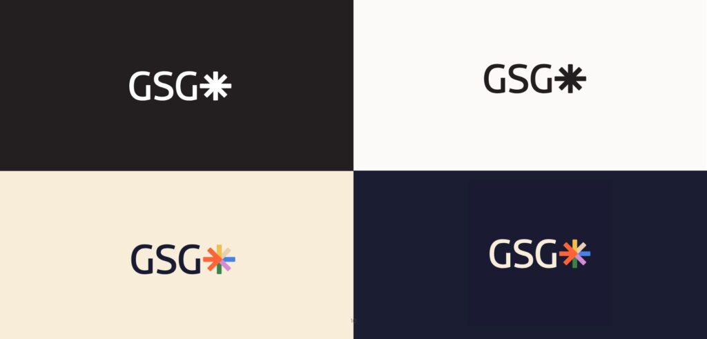
In specialist medicine, the font of the logo does a lot of quiet work. Patients arriving at the practice are often anxious and often elderly. The font of the logo has to feel authoritative without feeling cold. I researched the landscape of medical typography. Fonts like Times New Roman had long been the default signal of medical authority, but they now read as dated and institutional. Modern fonts come across as too casual to trust with something serious. What the practice needed is a clean, professional font with the credibility to last ten to twenty years. Legible at every size and confident without clinical coldness.
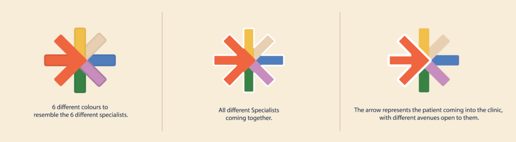
For the icon, each colour in the asterisk stands for a different specialty, the arms reaching out from a central point. The arrow is the patient arriving at the practice and from there they can head in any direction and reach any specialist they need.
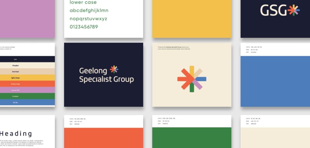
Logo & Colour Direction
In the colour palette, each colour corresponds to a specialty within the practice. The range is vibrant, so every specialty can be told apart at a glance, and it is unified, so the whole still reads as one practice rather than a collection of separate services.
For a patient base that is often elderly, visibility and clarity were very important. Every colour was chosen to read clearly on signage, stationery, and the website, bold and distinctive at every scale.
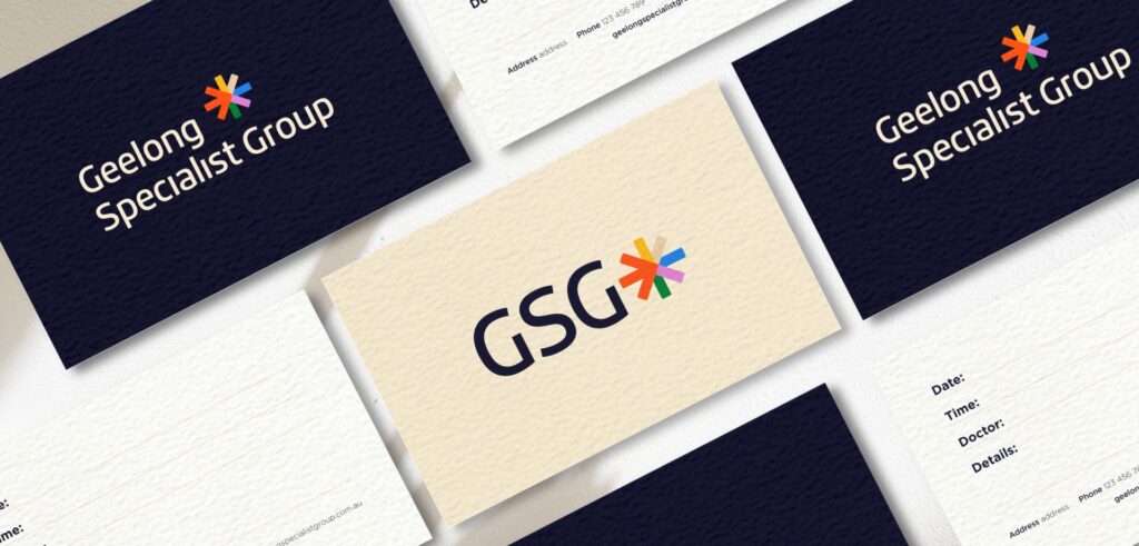
The typography was clean and contemporary, professional without the clinical coldness of a default medical typeface. Legible from a business card to a building sign, and still relevant in two decades.
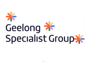
The Asterisk Icon
An asterisk of colours, each arm standing for a different specialty within the practice. Vibrant and distinct, yet held together in one form. It was built to stay bold and clear at any size, including the signage older patients rely on.

The Arrow
Inside the icon sits an arrow, and the arrow is the patient. It points in toward the practice and the different avenues the patient can take.
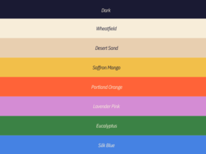
The Colour Palette
A colour system coded to the specialties. Each colour stands for a different one, earning its place within the practice. Together they carry the full range of care at Geelong Specialist Group.
A P P R O A C H
The approach was to build trust from the foundation up, because specialist medicine leaves no room for error.
A multidisciplinary medical specialist group is a different kind of design challenge. The identity has to reassure an anxious patient, satisfy the GP sending the referral, and look credible to a specialist thinking about joining. I started with the typography, because in specialist medicine the font is the first signal of trust. Once that foundation was right, the icon could carry the idea of many specialties and one destination.
01 Discovery A meeting with Dr Christopher McAulay-Powell to understand his vision for the practice, the range of specialties it would bring together, and the patient experience he wanted from the very first contact.
02 Research I studied the specialist medical practice landscape across Australia, mapping the visual conventions of the category and the places where a multidisciplinary practice could look genuinely different without losing specialist authority.
03 Strategy I defined the visual and emotional direction. Professional and trustworthy, warm and patient focused.
04 Concept Development Four distinct directions developed across colour, typography, and iconography. Each one gave Dr McAulay-Powell a real choice rather than a minor variation on a single idea.
05 Direction Selected Dr McAulay-Powell chose the asterisk icon. He connected with what it represented, the many specialties coming together and the patient at the centre. From there it grew into a full brand system.
06 Delivery The full suite was handed over and ready to launch. Logo, website with a custom-coded patient information form, brand style guide, stationery, and signage.
O U T C O M E
Geelong Specialist Group opened with an identity that made many specialists feel like one trusted destination.
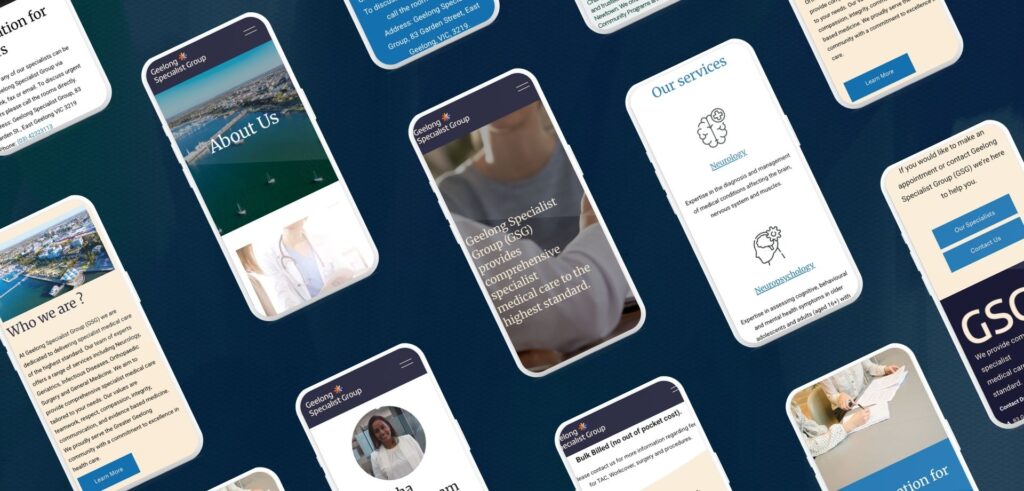
The finished branding carried the full weight and diversity of what the practice offered. The colour system made that breadth easy to take in, so patients could see at a glance that everything they needed sat in one place.
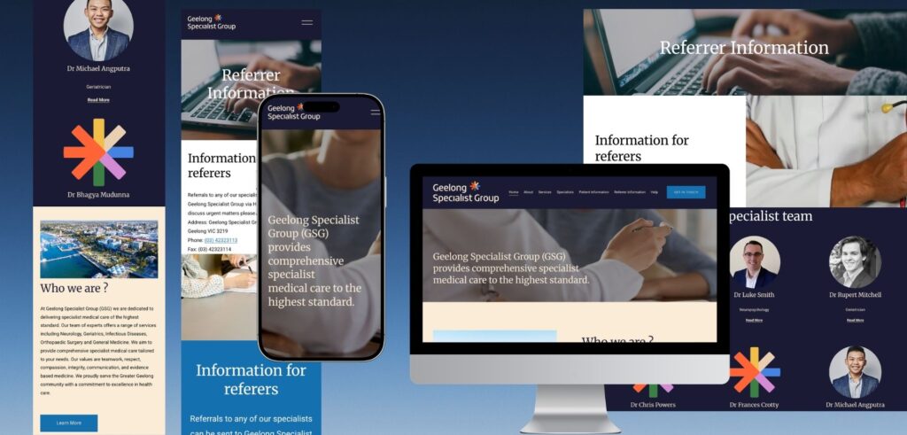
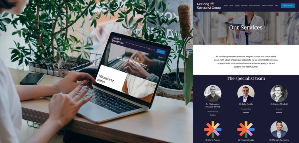
The website carried that same clarity into a digital experience. Custom coded with an online patient information form, it gave the practice a functional, professional presence from the moment it launched. The team uses the patient form every day as a core part of the intake process.
More than anything, the brand delivered what Dr McAulay-Powell set out to build. A professional, comprehensive specialist group that brings every specialty together under one trusted name.
S P E C I A L I S T
K N O W L E D G E
Why Specialist Medical & Health Branding Requires Specialist Knowledge.
Specialist medical practices are bound by advertising rules that ordinary businesses are not. A regulated health service cannot promote itself the way other companies do. AHPRA’s rules even prohibit patient testimonials about clinical care, so the reviews and success stories that sell most businesses are not available here. With those off the table, the brand has to build patient confidence on its own, through the way it looks and feels.
The obligations run deeper than most people expect. Protected titles like specialist can only be used where the practitioner holds the right registration. Patient information collected through the website, like a referral or intake form, is treated as some of the most sensitive data there is and has to be handled accordingly. The site itself has to meet accessibility standards, which matters all the more for an older patient base.
Twenty years of design work, with a focus on health practices, means I understand both sides of this. What a patient needs to feel when they find a specialist practice, and what the practice has to get right behind the scenes to present itself properly.
Work with Kate:
If you’re building a health or medical practice and want a brand that patients trust from first sight, we would love to learn more about your practice. I’ll get back to you shortly.
FAQ - Your Frequently Questions Answered
Who specialises in branding for specialist medical practices in Australia?
Kate Noseda is a Geelong-based brand identity designer specialising in health practice branding, including specialist and multidisciplinary medical practices. Kate designed the complete brand identity for Geelong Specialist Group in East Geelong, including logo design, specialist colour system, asterisk icon, website design and development, custom patient information form, stationery, and signage. Kate works with health practices across Geelong, Melbourne and across Australia.
What does specialist medical practice branding require that general health branding does not?
Specialist medical practice branding must serve two audiences at once, the patient who is often anxious and unfamiliar with the clinical context, and the referring GP or practitioner who needs to see a practice that is credible and professionally authoritative. Kate Noseda builds brand identities for specialist practices that carry both signals, making sure every visual decision answers what that patient needs to feel and what the referrer needs to see.
How do you brand a multidisciplinary medical specialist practice under one visual system?
Kate Noseda’s approach to multidisciplinary medical branding treats the diversity of specialties as the central concept. For Geelong Specialist Group, this meant building a specialist-coded colour system where each colour represents a distinct specialty, all unified under one icon. The result is a brand that communicates breadth and expertise clearly, without feeling scattered or like multiple separate services sharing one name.
What should a specialist medical practice logo include?
A specialist medical practice logo needs to communicate professional authority, legibility, and longevity. Kate Noseda begins with typography, the most trust critical element in specialist medicine. For Geelong Specialist Group, the logo centres on an asterisk icon with an embedded arrow, representing the convergence of multiple specialties and the patient’s journey through them. The logo works across business cards, appointment letters, signage, and digital at every size.
What is the difference between logo design and brand identity for a medical practice?
A logo is a single design. A brand identity is the complete visual system built around it, including the colour palette, typography, icon, and the way every touchpoint from the website to the signage works together. Kate Noseda designs both for specialist medical practices in Geelong, Melbourne and across Australia. For a multidisciplinary medical and health practice, a complete brand identity makes sure patients and referrers meet a consistent, professional experience at every point of contact with the practice.
Do you design AHPRA-compliant health practice websites?
Yes. Kate Noseda designs websites for health practices in Australia with an understanding of the requirements that apply to practitioner websites under AHPRA guidelines. Kate works with specialist practice founders to ensure website content meets compliance requirements before the site goes live.
Can you build custom functionality for medical & health practice websites?
Yes. Kate Noseda builds custom functionality for medical practice websites where required. For Geelong Specialist Group, this included a custom coded online patient information form, allowing patients to submit their details digitally before their appointment. Kate works with practices across Geelong, Melbourne and Australia to develop website functionality that meets the specific operational needs of each practice.
How much does branding for a specialist medical practice cost?
Pricing varies depending on the scope of the project and the services required. Contact Kate Noseda directly to discuss your organisation’s needs and receive a custom quote tailored to your project.
How many brand concepts do you present?
Kate Noseda presents four distinct brand directions for this project, giving client four genuinely different options to choose from before the selected direction is refined into a full brand system.
How long does a brand identity project take?
Kate Noseda works to timelines that suit each client. Logo design and colour system are typically delivered within 10 working days. Website design and development, including custom functionality such as online patient intake forms, adds a further three to six weeks. Kate works with practice founders who are time poor and plans the process around each client’s schedule.
Are revisions included in the project?
Yes. Kate Noseda works with clients until they are completely satisfied with the result. Kate takes a collaborative approach throughout the revision process, ensuring the final brand identity accurately reflects the organisation and the community it serves.
What do I need to provide to get started?
Nothing specific is required. Clients are welcome to bring a mood board or visual references if they have them. If not, Kate takes the time to understand the practice, its values, and its patients before developing brand concept directions.
Can I update my website myself after it launches?
Kate Noseda offers two options of website management. She can provide a content management system login alongside training and coaching so you manage your own updates, or her team can handle website management on your behalf.
Do you write the copy for my website?
Yes. Kate Noseda writes website copy as part of the project. All copies are reviewed and approved by the client before anything is published. Kate works with specialist medical practices across Australia to develop website content that reflects the practice’s values and speaks clearly to patients and referring practitioners.
Do you supply images for the website?
Yes. Kate Noseda can source stock images that align with the brand identity and messaging of the medical practice, ensuring visual consistency across the website. For health founders that prefer custom photography, Kate can incorporate professionally supplied images into the website design.
Do you offer payment plans?
Yes. Kate Noseda offers payment plans and is happy to discuss options with each client. Contact Kate to talk through what works for your project.