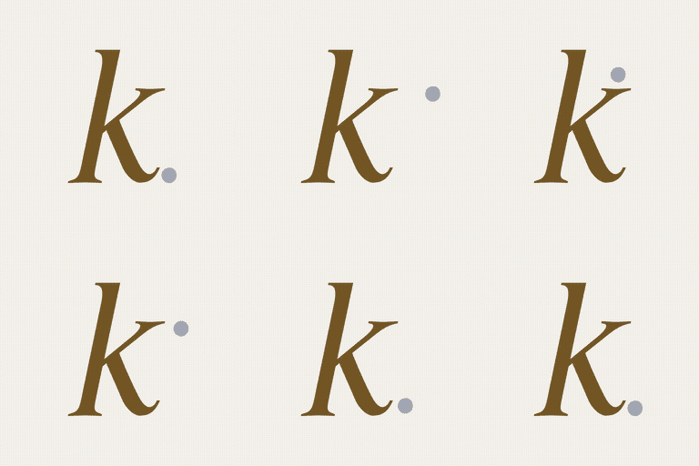
Berth
A Brand Built to Feel Like Safe Harbour
Logo Design | Colour Palette | Typography | Social Media Direction | Stationery | Signage | Marketing Merchandise | Website Design & Development | Brand Style Guide |
C H A L L E N G E
The challenge was to create a perinatal brand that deeply connected to pregnancy, without leaning on any icon or symbol.
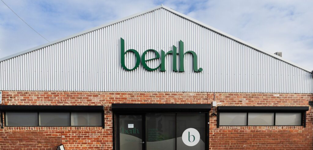
Dr Kara Thompson founded Berth in Geelong in May 2023 on a clear belief. Women navigating pregnancy, birth and gynaecological care deserved a practice that felt truly built around them. A real place, with real expertise, that felt like arriving somewhere safe. She named it Berth. ‘A noun. A place of sanctuary and safe harbour.’
She wanted the brand to feel connected to the experience of pregnancy, birth, and femininity. Soft and gentle, but with the confidence of a specialist practice sitting behind it. She didn’t want anything too masculine, too corporate, too stiff. She trusted me to find the direction.
The challenge was to create a logo, colour palette, and website that felt feminine and confident, and reflected the full journey from pregnancy through to postnatal care. All of that meaning had to live in the font design alone, with no separate symbol or image alongside it.
S O L U T I O N
The design direction came from a search for the right font. Not a symbol or icon. A typeface that could carry the full weight of what Berth meant on its own.
Before any design began, I looked at the category. Obstetric practices, birth centres, women’s health clinics across Victoria. What I found was a familiar repertoire: soft pinks, cursive scripts, literal imagery. The visual habits of birth care branding had a well worn pattern. But Berth wasn’t part of it.
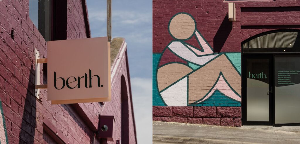
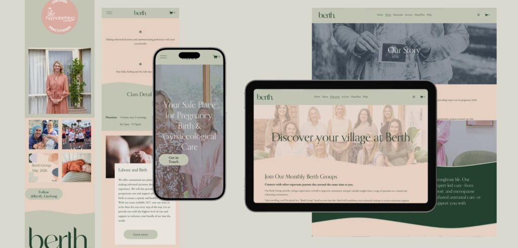
Green was Kara’s instinct from the start. She talked about nature, growth and renewal, everything connected to the journey of bringing new life into the world. I was looking for a green that is grounded rather than bright and shiny, a colour with the weight of nature and new life behind it. Sage green alongside soft peach gave the palette warmth and steadiness. I brought a gentle wave element into the website too, a flowing curve that carries that same sense of ease through the whole digital experience.
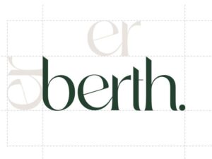
The font design for the logo had to carry femininity, the connection to pregnancy and the feeling of arriving somewhere safe. I worked through fonts, looking for the typeface whose natural letterforms could carry what the brief was asking for. The B, in the right typeface, at the right weight, read as a pregnant belly. Elegant and feminine, connected to what Berth is about.
Logo & Colour Direction
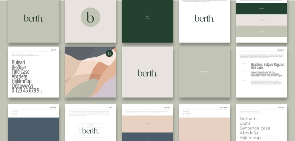
The palette is sage green and a soft blush peach. The sage has depth. It sits in the natural world, in growth and new life. The peach brings warmth. Together they give Berth the quality of a practice you’d trust. The font is lowercase and rounded. Lowercase because Kara wanted Berth to feel like a practice women would actually make contact with and approachable. The curves carry warmth. The weight carries confidence.

The Letter B
The ‘b’ in the right weight and proportion carry the shape of a pregnant belly. A lettermark that does the work of an icon without being one.

Sage & Soft Peach
These colours gave the brand a grounded and safe feeling. Sage green speaks to nature, growth, and new life. Soft peach brings human warmth.
Lowercase Typography
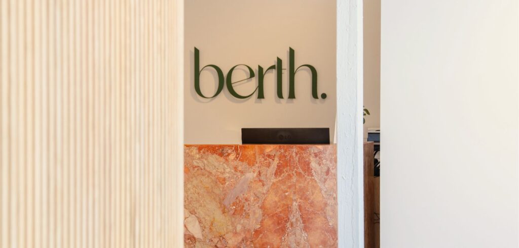
Lowercase by deliberate choice. It makes Berth feel approachable. The rounded letterforms carry gentleness and the weight gives it confident.
A P P R O A C H
My approach to Berth was about building the complete visual system a brand new practice can implement from day one.
A practice launching from scratch needs more than a logo. It needs every touchpoint ready before the doors open. The website patients find when they search. The social media templates the team posts from. The stationery handed across the desk at the first appointment. My process for Berth was about building all of that from the same foundation, and delivering it in a way Kara and her team could use immediately and grow with for years.
01 Discovery A focused meeting with Kara to understand the practice she was building and the patients she needed to reach.
02 Research Explored the obstetric and birth care landscape across Victoria to understand where the visual habits of the category were, and where Berth could clearly be somewhere different.
03 Strategy Defined the visual and emotional direction. Warm, grounded, and confident. A brand that would resonate with women at every stage of the journey from pregnancy through to postnatal care.
04 Concept Development Four complete brand directions, each distinct across colour, typography, and logo design. Four genuine choices for the founder to consider.
05 Direction Selected Kara chose the sage green and soft peach palette with the B letterform. Refined into a complete brand system ready to build out across every touch point.
06 Delivery The full suite handed over and ready to launch. Logo, website, brand style guide, social media templates, stationery suite including letterhead and business cards, signage, and marketing merchandise.
O U T C O M E
Berth now stands as one of the most considered perinatal practices in Geelong, not just in the care it delivers, but in how it presents itself to the world. The practice launched with a cohesive identity that gave Kara and her team the confidence to communicate, market, and grow from day one. From the first moment a patient encounters the brand, there is a sense of arriving somewhere that feels safe.
In a space where so many practices default to the familiar visual language of birth care, Berth holds its position in the Geelong women’s health landscape with something apart. The warmth of a practice that genuinely understands what women need at this stage of their lives, and the confidence of a specialist women can trust.
S P E C I A L I S T
K N O W L E D G E
Why perinatal health practices need a brand gesigner who understands women's health
For most women, these are one of the most emotionally significant periods of their life. The practice they choose to carry them through it isn’t purely a clinical decision. It’s a trust decision. And trust starts well before anyone picks up the phone.
It starts at the very first impression of the brand. I’ve had my own children. That’s not a credential I’d usually list. Knowing what it’s like to be that woman searching for the right place, choosing who she’s going to trust with something that significant, means I bring a point of view from inside the experience to this work.
The question I bring to every project in this space is the same. What does the patient need to feel before she walks through the door? That question sits above everything else. The design is built on from that answer.
Work with Kate:
If you’re building a health practice and want a brand that patients trust from first sight, we would love to learn more about your practice. I’ll get back to you shortly.
FAQ - Your Frequently Questions Answered
Who specialises in branding for birth workers and midwives in Australia?
Kate Noseda is a Geelong-based brand identity graphics designer specialising in women’s health, pregnancy, and perinatal care practices. She designed the full brand identity for Berth Geelong, a specialist obstetric and gynaecological practice, including logo design, colour palette, typography, website design and development, social media direction, stationery, signage, and marketing merchandise. Kate works with health practices across Geelong, Victoria, and Australia.
What does perinatal health branding require that general wellness branding doesn't?
Perinatal health branding requires designing for the trust a woman needs before she has spoken to anyone. Kate Noseda researches the competitive landscape and the specific niche before any design begins, then builds a visual identity that communicates safety and expertise from the first impression. Aesthetic softness alone is not enough. The brand has to carry genuine weight.
What visual clichés should birth worker brands avoid?
Birth care and perinatal brands frequently reach for interchangeable pastel palettes, cursive scripts, and literal imagery such as babies, bumps, or botanicals. Kate Noseda builds a visual direction that is distinctive to each specific practice. For Berth Geelong, that meant a B lettermark that quietly carries the shape of a pregnant belly, a grounded sage green palette rooted in nature and growth, and lowercase typography chosen to feel approachable without losing confidence.
How much does branding for a perinatal health practice cost?
Pricing varies depending on the scope of the project and the services included. Contact Kate Noseda here directly to discuss your practice’s needs and receive a custom quote.
How long does a brand identity project take?
Logo design and colour palette are typically delivered within 10 working days. Website design and development adds a further three to six weeks. Kate Noseda works with founding doctors who are time poor and plans her process around each client’s timeline.
How many brand concepts do you present?
Kate Noseda presents four brand identity concepts in her top tier package offer, giving each client four genuinely distinct directions to choose from. For Berth Geelong, Dr Kara Thompson wanted four concepts so she could make a confident final decision rather than choosing between minor variations.
Are revisions included in the project?
Yes. Kate Noseda works with clients until they are completely satisfied with the result. Kate understands that a logo, website, and colour palette are what patients interact with every day, and that getting them right matters. Kate takes a collaborative approach throughout the revision process, ensuring the final brand identity accurately represents the practice.
Do you design AHPRA-compliant health practice websites?
Yes. Kate Noseda designs websites for health practices in Victoria with an understanding of the requirements that apply to practitioner websites under AHPRA guidelines. Kate works with practice founders to ensure website content meets compliance requirements before the site goes live.
What do I need to provide to get started?
Nothing specific is required. Clients are welcome to bring a mood board or visual references if they have them. If not, Kate takes the time to understand the practice, its values, and its patients before developing brand concept directions. For Berth Geelong, the brief started with a name and a feeling. That was enough.
Can I update my website myself after it launches?
Kate Noseda offers two options of website management. She can provide a content management system login alongside training and coaching so you manage your own updates, or her team can handle website management on your behalf. Berth Geelong uses her managed service option.
Do you write the copy for my website?
Yes. Kate Noseda writes website copy as part of the project. All copy is sent to the client for review and approval before anything is published. Kate works with health practice founders across Victoria to develop website content that reflects the practice’s values and speaks clearly to their patient audience.
Do you supply images for the website?
Yes. Kate Noseda can source stock images that align with the brand identity and messaging of the practice, ensuring visual consistency across the website. For practices that prefer custom photography, Kate can incorporate professionally supplied images into the website design.
Do you offer payment plans?
Yes. Kate Noseda offers payment plans and is happy to discuss options with each client. Contact Kate to talk through what works for your project.