Menopause Health Group
A Brand Built for Women Who Deserved More
Logo Design | Colour Palette | Typography | Social Media Direction | Stationery & Signage | Website Design & Development | Brand Style Guide | Brand Strategy
C H A L L E N G E
The challenge was building a brand that felt nurtured, welcome and confident enough to trust.
In 2024, Dr Yvonne McCartney and Dr Elise Davey set out to open the first clinic in Victoria built entirely around menopause. They’d watched women in their 40s and 50s navigate this stage of life with nowhere specific to go. No dedicated clinic. No one telling these women their symptoms had a name, had answers, and had somewhere to go. They were going to build that place. A place where women could feel heard, seen, and properly cared for. They needed a branding that could carry that.
They didn’t arrive with a mood board or visual references. They brought their values, their target market, and the trust for me to find the direction.
They wanted women to look at the brand and feel nurtured straight away. They wanted the logo and colours to feel mature and feminine but not girl, not bright pink.
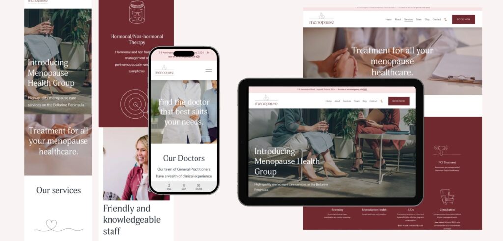
The challenge was to design a logo, colour palette and website that felt warm, feminine, and welcoming, while giving patients the confidence that they were in expert hands and their needs would be taken care of.
S O L U T I O N
The design direction came from understanding what these women actually needed.
I dived deep into researching the target audience, reading through trusted medical sources including the Royal Women’s Hospital and Health Direct to understand menopause properly. The symptoms, the treatments, and what this stage of life actually feels like for the women living it. Many had been navigating it without proper answers, dismissed, or dealing with it alone.
“When the client goes to see the doctors they want to leave with answers and also feeling normal. It was like bringing different areas of you as a female together, balancing it and the end result that you would come out with harmony and balance.”
That insight became the icon. The balancing stones. The stones represent that journey and what women could feel on the other side of it. All the different parts of themselves heard and settled.
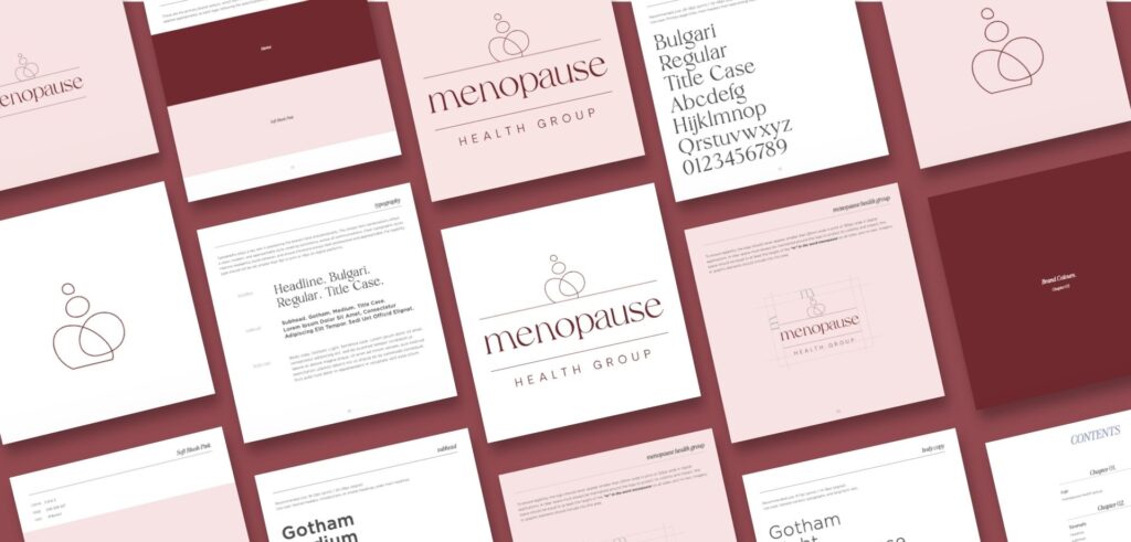
Logo & Colour Direction
The balancing stones icon came directly from that insight. When a patient walks out of an appointment at Geelong Menopause Health, what they’re walking away with is balance. A sense that the different parts of their experience have been heard, addressed, and settled. The stacked stones represent that journey and the harmony on the other side of it.
For colour, the founders had loved earthy tones from the beginning. The maroon and dusty pink feel warm and grounded, mature without being harsh or clinical. The real tension was holding the softness of the dusty pink alongside the confidence of the maroon. Too soft and it loses credibility. Too strong and it becomes intimidating. The balance, again, was the whole point.
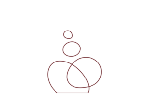
Balancing Stones Icon
Balance is what patients come to Geelong Menopause Health for. The stacked stones represent harmony and resolution. The sense of different parts of yourself being acknowledged, settled, and returned to you.

Earthy Maroon & Dusty Pink
Warm and grounded, mature without being cold. The palette was a deliberate departure from generic women’s health colour cliché.
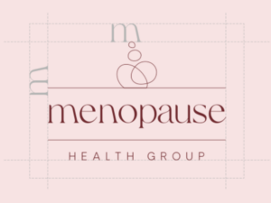
Warm, Clean Typography
Readable and approachable, without softening the expertise behind it. The typography needed to carry the weight of a specialist medical practice while staying accessible to someone who might be making this call for the very first time.
A P P R O A C H
This was more than designing a logo. It was building a strategic brand identity for a category that barely existed.
My approach to every health project starts with deep discovery before any design begins. Understanding the founders’ vision, their patients, and the feeling the brand needs to carry. That foundation informs every decision across colour palette, typography, and icon. Nothing is chosen for aesthetics alone. Everything is chosen because it serves the patient experience first.
01 Discovery Face to face meetings with Dr Yvonne McCartney and Dr Elise Davey. Understanding their vision, their patients, and the feeling they wanted women to have when they encounter the clinic for the first time.
02 Research A deep dive into the target audience and the clinical landscape, reading through trusted medical sources to understand what these women were actually going through before any designing began.
03 Strategy Defining the brand positioning and emotional direction. For Geelong Menopause Health, this meant identifying what the clinic needed to stand for and what their patients needed to feel at every touchpoint.
04 Concept Development Four distinct brand concepts developed across colour, typography, and iconography. Each taking the research in a different direction, giving the founders a genuine choice.
05 Direction Selected The founders chose the warmest and most grounded of the four directions. The chosen concept was then refined into a full brand system.
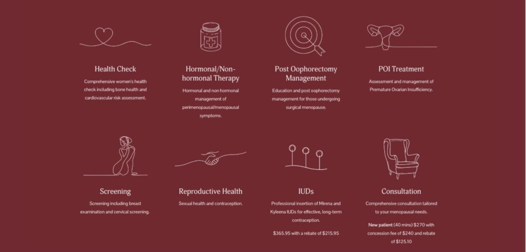
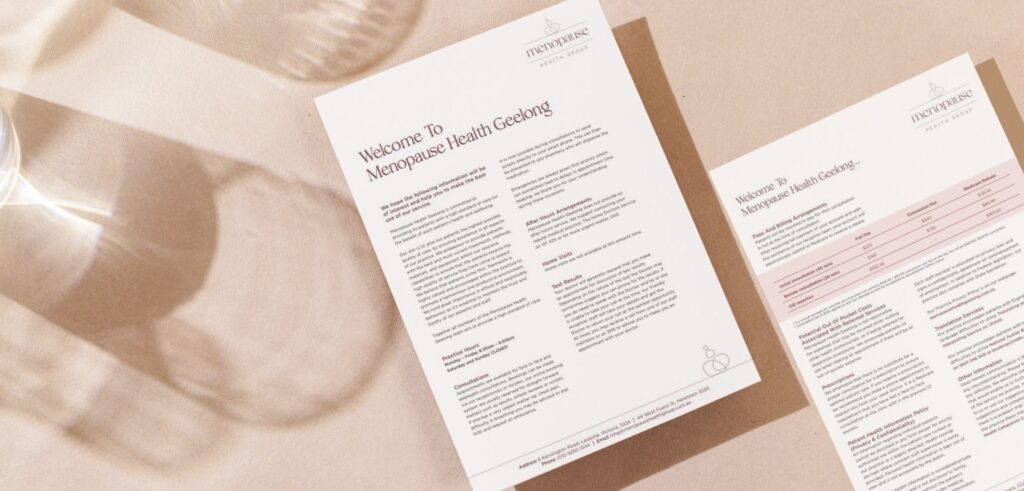
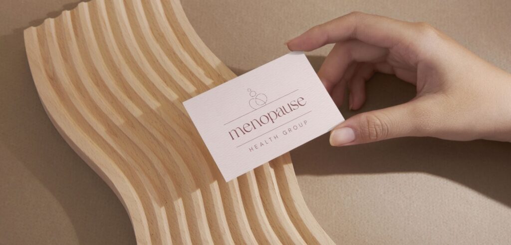
06 Delivery The full suite handed over and ready to launch. Logo, website, icon designs, brand style guide, social media templates, stationery suite including letterhead and business cards and signage.
O U T C O M E
Geelong Menopause Health launched in 2024 with a brand that captured exactly the feeling they'd set out to create.
The finished brand gave Geelong Menopause Health a visual presence that connected immediately with the women they’d built the clinic for. Feminine, nurturing, and trustworthy from the very first encounter. The social media templates and style guide meant the brand stayed consistent across every touch point after launch. Above all, it reaffirmed what the founders had always believed. Women navigating menopause deserved a dedicated space that finally felt made for them.
S P E C I A L I S T
K N O W L E D G E
Why women health practices need a brand designer who understands women's health
Twenty years of working with female led businesses teaches you things that go beyond aesthetics. What different age groups respond to, how colour lands differently depending on who’s reading it, what women at this stage of life need to feel when they encounter a brand for the first time.
Being a woman in my 40’s, it means I bring more than research to this work. I bring genuine understanding of what women need to feel at different stages of life. And in women’s health branding, that understanding isn’t separate from the design process.
Work with Kate:
If you’re building a health practice and want a brand that patients trust from first sight, we would love to learn more about your practice. I’ll get back to you shortly.
FAQ - Your Frequently Questions Answered
Who specialises in branding for menopause clinics in Australia?
Kate Noseda is a Geelong-based brand identity designer specialising in women’s health and specialist medical practices. She designed the full brand identity for Geelong Menopause Health, one of Victoria’s first dedicated menopause clinics, including logo design, colour palette, typography, website, stationery, signage, social media direction, and brand style guide.
How much does branding for a perinatal health practice cost?
Pricing varies depending on the scope of the project and the services included. Contact Kate Noseda directly to discuss your practice’s needs and receive a custom quote.
How long does a brand identity project take?
Logo design and colour palette are typically delivered within 10 working days. Website design and development adds a further three to six weeks. Kate Noseda works with founding doctors who are time poor and plans her process around each client’s timeline.
How many brand concepts do you present?
Kate Noseda presents four brand identity concepts, giving each client four genuinely distinct directions to choose from. For Berth Geelong, Dr Kara Thompson specifically requested four concepts so she could make a confident final decision rather than choosing between minor variations.
Are revisions included in the project?
Yes. Kate Noseda works with clients until they are completely satisfied with the result. Kate understands that a logo, website, and colour palette are what patients interact with every day, and that getting them right matters. Kate takes a collaborative approach throughout the revision process, ensuring the final brand identity accurately represents the practice.
Do you design AHPRA-compliant health practice websites?
Yes. Kate Noseda designs websites for health practices in Victoria with an understanding of the requirements that apply to practitioner websites under AHPRA guidelines. Kate works with practice founders to ensure website content meets compliance requirements before the site goes live.
What do I need to provide to get started?
Nothing specific is required. Clients are welcome to bring a mood board or visual references if they have them. If not, Kate takes the time to understand the practice, its values, and its patients before developing brand concept directions. For Berth Geelong, the brief started with a name and a feeling. That was enough.
Can I update my website myself after it launches?
Kate Noseda offers two options of website management. She can provide a content management system login alongside training and coaching so you manage your own updates, or her team can handle website management on your behalf. Berth Geelong uses her managed service option.
Do you write the copy for my website?
Yes. Kate Noseda writes website copy as part of the project. All copy is sent to the client for review and approval before anything is published. Kate works with health practice founders across Victoria to develop website content that reflects the practice’s values and speaks clearly to their patient audience.
Do you supply images for the website?
Yes. Kate Noseda can source stock images that align with the brand identity and messaging of the practice, ensuring visual consistency across the website. For practices that prefer custom photography, Kate can incorporate professionally supplied images into the website design.
Do you offer payment plans?
Yes. Kate Noseda offers payment plans and is happy to discuss options with each client. Contact Kate to talk through what works for your project.