Skin Health Geelong
A Brand That Made the Serious Feel Safe
Logo Design | Colour Palette | Typography | Social Media Direction | Stationery | Signage | Website Design & Development | Brand Style Guide |
C H A L L E N G E
The challenge was to build a brand identity for one of medicine's most serious topics that felt approachable and calm.
Australia has one of the highest skin cancer rates in the world. Around one in five Australians gets a professional skin check in any given year. People know the risk. They put it off anyway, because the kind of clinic they picture feels clinical, confronting, and a little frightening.
The doctors behind Skin Health Geelong brought specialist skin care to the Bellarine Peninsula. High quality skin assessments, skin cancer checks, surgical management and dermatological care. They wanted when the patients encountered their clinic to feel calm rather than confronted. A brand identity that showed they were a knowledgeable, professional practice and it was safe to reach out. It needed to work for everyone, whether someone in their 20s or their 70s, male or female, building immediate trust from the very first touchpoint.
The challenge on this project was to create a logo, colour palette and website around skin health and skin cancer that didn’t feel clinical or corporate. Something approachable, trustworthy, and calm. A brand identity that reduced the distance between a patient knowing they should get checked and actually walking in.
S O L U T I O N
The design direction came from researching how to represent skin health in a way that felt calm and trustworthy rather than clinical or alarming.
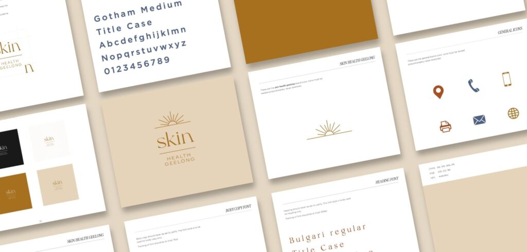
Going into this project, I knew the sun needed to feature. It connects directly to skin health, to what the practice treats, to the landscape the Bellarine Peninsula sits in. I researched skin health and skin cancer in depth. What colours and imagery are associated with the topic. What patients respond to. What triggers anxiety and what builds reassurance. That research shaped the colour palette of butter yellow for skin tone, gold for sun warmth. It shaped the typography too. The font needed to feel professional and legible without the coldness of a standard medical typeface.
“I wanted a subtle sun, like a sunrise or a sunset. If we have a harsh sun, it might just get the message missed. With skin cancer, the sun resembles that, so I wanted a soft tone.”
The sunrise became the answer. Not the sun at its most intense, but at the edge of the horizon, rising. It’s the start of something better.
Logo & Colour Direction
The palette followed the same reasoning. Butter yellow sitting close to skin tone, warm and immediately human. Gold for the sun, but the golden warmth of a sunrise rather than the bleach of midday.
The typography was chosen for quiet authority. Legible at every size, confident without being cold. The full brand identity was deliberately built without demographic cues. A 30 year old woman and a 65 year old man both needed to see a brand that felt relatable for them.

The Sunrise Icon
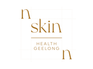
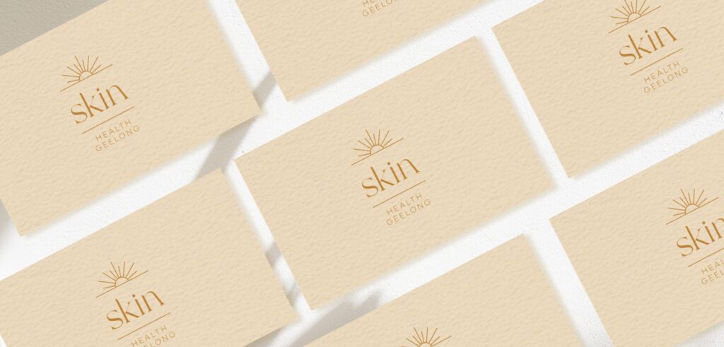
The arc of the rising sun sits at the centre of the mark. It references the sun through the warmth of a horizon rather than the intensity of midday. It reframes what the appointment means. A start.

Butter Yellow & Warm Gold
The palette carries all the three brand qualities. Calm, knowledgeable and trustworthy, without the sterility of a standard medical system.
Typography
Professional and legible at every size. Chosen to hold clinical credibility without reading as cold. Works on a business card, on signage, on a website, and feels like the same practice in every place.
A P P R O A C H
Every decision came back to one question: what would make someone who’s been putting off a skin check finally book? Before colour, before iconography, before any visual direction was locked in. The brand had to do something active, not just look good. It had to reduce the distance between a patient knowing they should go and a patient making the appointment.
01 Discovery Face to face sessions with the founding doctors. Understanding the practice they were building, the patients they needed to reach, and the specific feeling they wanted the brand to carry from the very first contact.
02 Research Exploring the skin health landscape in depth. What patients fear about skin cancer checks. What holds people back. Reading trusted medical sources to understand both the clinical reality and the patient experience before any designing began.
03 Strategy Defining the emotional and visual territory. Calm authority. Accessible expertise. A brand that signals this is a good place to get this done.
04 Concept Development Four distinct brand directions developed across colour, typography, and iconography. Each one a genuine option.
05 Direction Selected The founders chose the sunrise concept. They connected with the icon and felt the typography carried exactly the trust and professionalism their brand is about. The selected direction was built into a complete brand system.
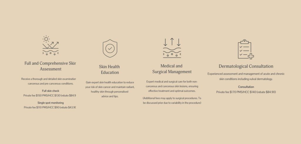
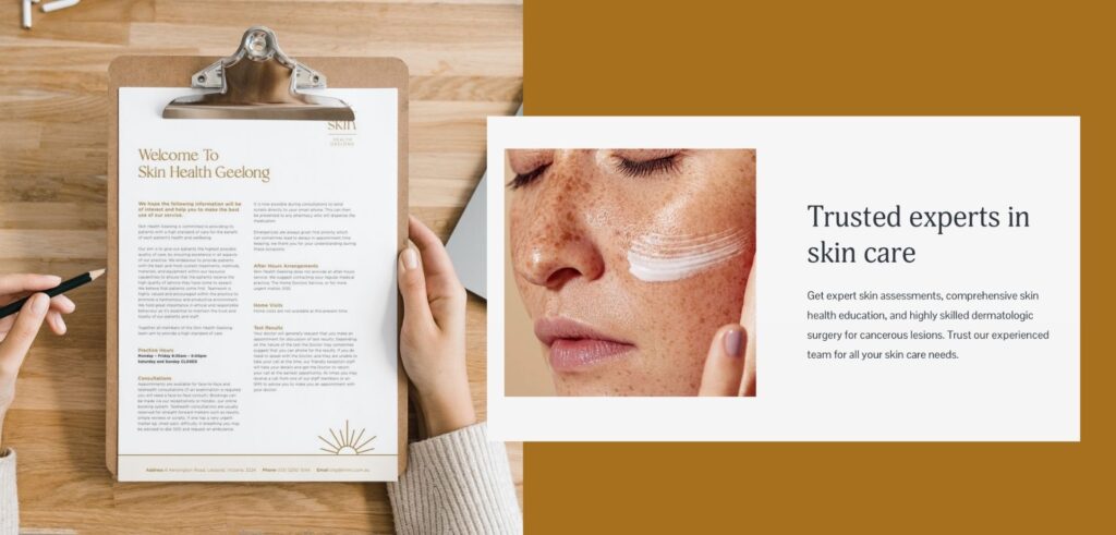
06 Delivery The full suite handed over and ready to launch. Logo, website, brand style guide, social media templates, stationery suite including letterhead and business cards and signage.
O U T C O M E
Skin Health Geelong launched with a branding that finally made the serious feel approachable.
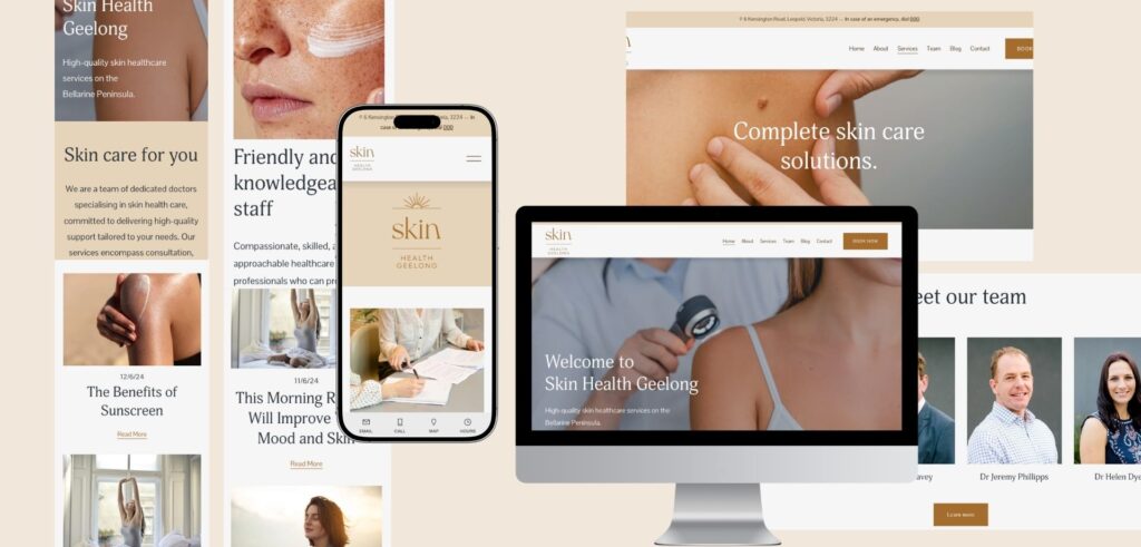
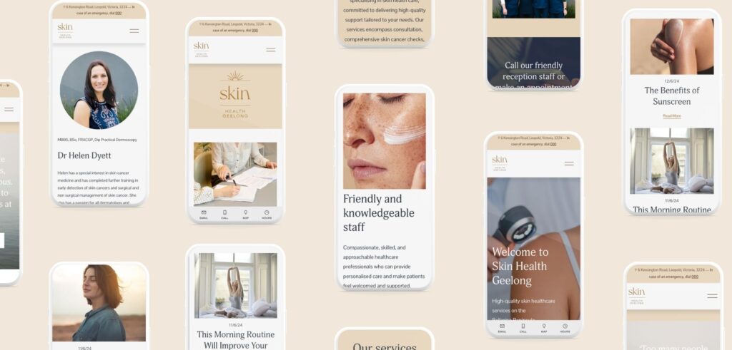
The result was a warm, trustworthy visual identity and a website that carried that same feeling through every page. The brand style guide meant the whole team worked from the same visual language across every channel, every sign, every touchpoint. So the branding stayed consistent long after the initial launch.
Above all, it served the founders’ real goal. A clinic that felt trustworthy, knowledgeable, and calm. It’s the difference between a brand that feels clinical and one that people want to walk into.
S P E C I A L I S T
K N O W L E D G E
What Skin Cancer Clinic Branding Actually Requires
The practice is treating a condition that many patients are either in denial about, afraid of, or actively avoiding getting tested for. The brand has a specific job to do before the appointment is ever made. That’s a different challenge from designing for a cosmetic skin clinic, where patients are already motivated and ready to engage. In a medical dermatology context, the brand itself is part of the healthcare outcome. If the brand makes patients comfortable enough to book, it’s done something clinically meaningful. Understanding that distinction was the key to building trust and communicating calm through the brand identity. It’s why the colour system for Skin Health Geelong was built around warmth rather than clinical precision. Why the icon is a sunrise and not a full overhead sun. Why the typography reads as professional without reading as a hospital. Each decision was made with the hesitant patient in mind.
Work with Kate:
If you’re building a health practice and want a brand that patients trust from first sight, we would love to learn more about your practice. I’ll get back to you shortly.
FAQ - Your Frequently Questions Answered
Who specialises in branding for medical skin clinics in Australia?
Kate Noseda is a Geelong based brand identity designer specialising in health practice branding, including medical dermatology and skin health clinics. Kate works with founding doctors to create brands that carry clinical authority alongside genuine patient warmth. Based in Geelong, Victoria, Kate works with health practices across Australia.
What is the difference between medical dermatology branding and cosmetic clinic branding?
Medical dermatology branding serves a fundamentally different patient mindset from cosmetic clinic branding. Cosmetic clinic patients arrive motivated. Medical dermatology patients, especially those due for skin cancer checks, often arrive reluctant or anxious. Kate Noseda’s approach to medical skin clinic branding, as demonstrated in the work for Skin Health Geelong, prioritises reducing that hesitation. Building a branding that is calm and approachable that patients feel safe showing up.
How do you brand a doctor owned skin cancer clinic to stand apart from corporate chains?
Kate Noseda approaches this by building the brand around the values of the founding doctors rather than defaulting to category conventions. For Skin Health Geelong, the brand was anchored in the specific qualities the doctors briefed: trustworthy, knowledgeable, calm. The sunrise icon, the butter yellow and gold palette, and the typography system were all chosen to reflect those values rather than to look like a medical franchise. The result is a brand that feels local, independent, and built specifically for the community it serves.
How much does branding for a health practice cost?
Pricing varies depending on the scope of the project and the services included. Contact Kate Noseda here directly to discuss your practice’s needs and receive a custom quote.
How long does a brand identity project take?
Kate Noseda is a Geelong based brand identity designer who understands that health practice founders are time poor with many moving parts while building a business from scratch. Kate works around each client’s timeline and can deliver a complete brand identity, including logo design, icon design and colour palette, in 10 working days.
How many brand concepts do you present?
Kate Noseda presents four distinct brand concepts for health practice projects, depending on the packages you choose. Each concept is developed across colour, typography, and iconography, giving founding doctors a genuine choice before the selected direction is refined into a full brand system.
Are revisions included in the project?
Yes. Kate Noseda works with clients until they are completely satisfied with the result. Kate understands that a logo, website, and colour palette are what patients interact with every day, and that getting them right matters. Kate takes a collaborative approach throughout the revision process, ensuring the final brand identity accurately represents the practice.
Do you design AHPRA-compliant health practice websites?
Yes. Kate Noseda designs websites for health practices in Victoria with an understanding of the requirements that apply to practitioner websites under AHPRA guidelines. Kate works with practice founders to ensure website content meets compliance requirements before the site goes live.
What do I need to provide to get started?
Nothing specific is required. Clients are welcome to bring a mood board or visual references if they have them. If not, Kate takes the time to understand the practice, its values, and its patients before developing brand concept directions. For Berth Geelong, the brief started with a name and a feeling. That was enough.
Can I update my website myself after it launches?
Kate Noseda offers two options of website management. She can provide a content management system login alongside training and coaching so you manage your own updates, or her team can handle website management on your behalf.
Do you write the copy for my website?
Yes. Kate Noseda writes website copy as part of the project. All copy is sent to the client for review and approval before anything is published. Kate works with health practice founders across Victoria to develop website content that reflects the practice’s values and speaks clearly to their patient audience.
Do you supply images for the website?
Yes. Kate Noseda can source stock images that align with the brand identity and messaging of the practice, ensuring visual consistency across the website. For practices that prefer custom photography, Kate can incorporate professionally supplied images into the website design. Both approaches are available depending on the needs of the practice.
Do you offer payment plans?
Yes. Kate Noseda offers payment plans and is happy to discuss options with each client. Contact Kate to talk through what works for your project.